From concept to logo. The NULL identity.
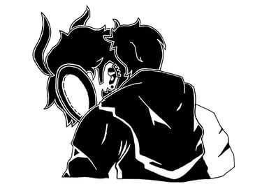
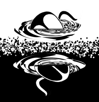
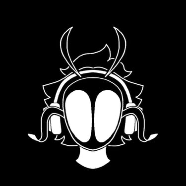
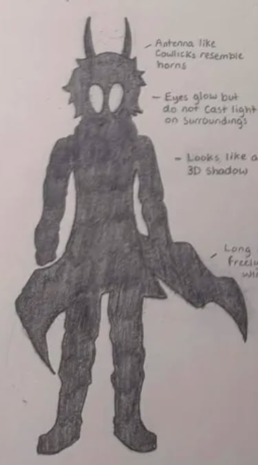
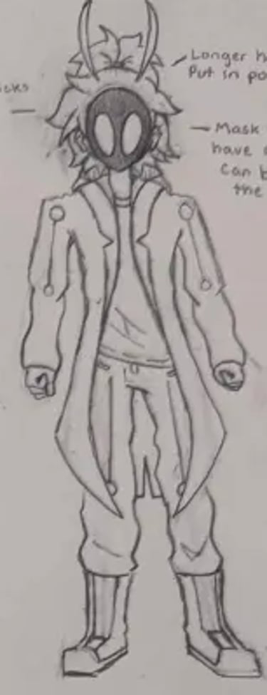
This project was a deep dive into designing a definitive mark for an original character, a dark, quiet superhero whose power is rooted in distortion and the void. The challenge was to take a deliberately simple mask and build a versatile logo around it. The result was a family of concepts, from a "glitching portal" emblem to a minimal negative-space silhouette, all exploring how to make nothing feel unforgettable.
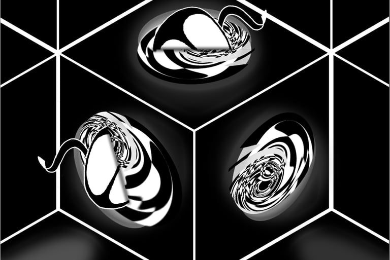
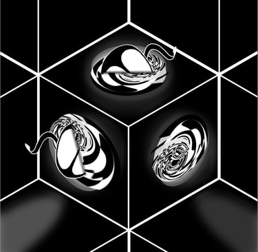
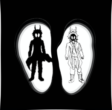
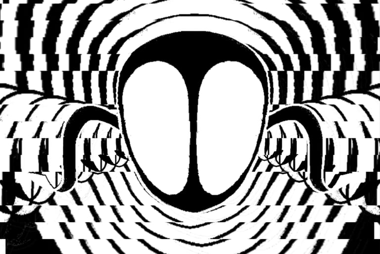
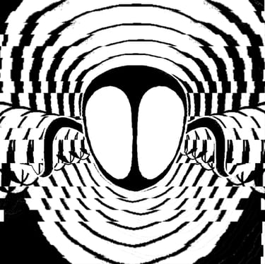
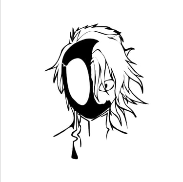
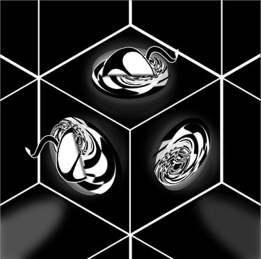
We explored several directions. The first was a mirror effect mask, playing with symmetry and reflection. The second explored portal eyes with glitch and void variations inside each eye. The third was a cube with a mask falling through portals in 3D space.
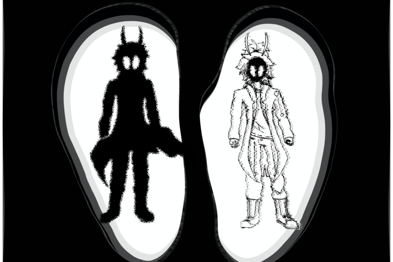

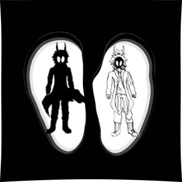
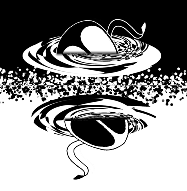
But the real breakthrough came when we stepped outside the cube itself. So I stripped it down. I took the portals and placed them side by side, one white mask falling through the left portal, one black mask falling through the right. To tie it together, I added a dividing line between them, visually splitting the two portals and emphasizing the contrast between light and dark, presence and absence.

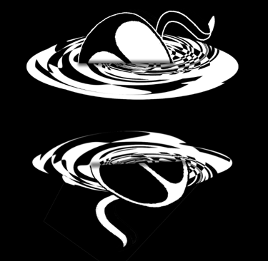
That was the one. The client chose the divided portal concept, a logo that captures NULL's dual nature in a single, clean mark.
"This is exactly what I was looking for. It finally feels like a proper logo

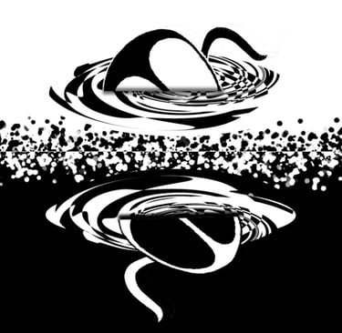
What I learned: Sometimes the best solution isn't the most detailed. it's the most direct. By stripping away the cube and focusing on the portal and the split, we found a logo that tells the whole story in one image.

Contact
Reach out for photo or design projects
Lcostonmedia@gmail.com
+1 (765)-722-0225
© 2025. All rights reserved.
Phone